Silverbullet
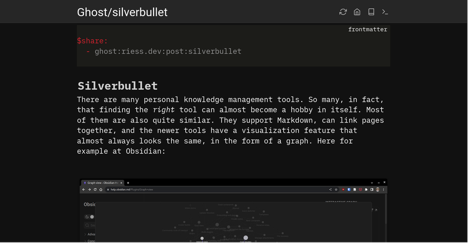
There are many personal knowledge management tools. So many, in fact, that finding the right tool can almost become a hobby in itself. Most of them are also quite similar. They support Markdown, can link pages together, and the newer tools have a visualization feature that almost always looks the same, in the form of a graph. Here for example at Obsidian:
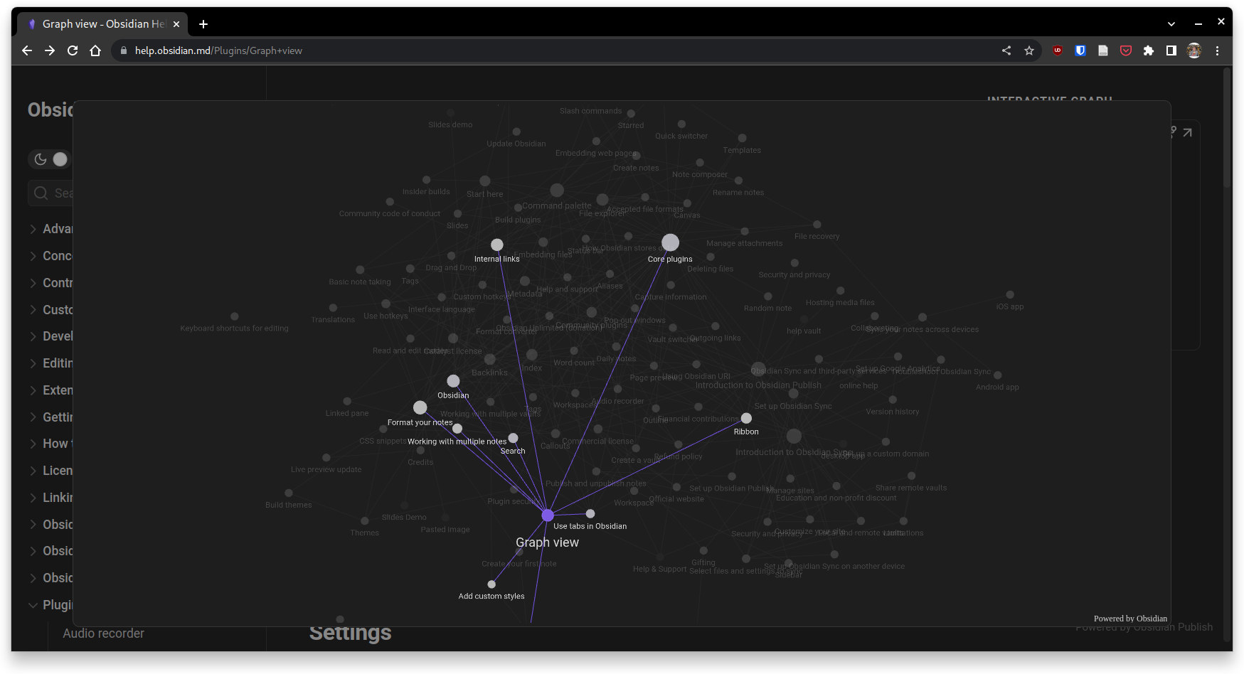
Admittedly, this is also a damn strong feature. The only thing is that the developers of Obsidian rely a bit too much on the principle of local data. This means that you have to install Obsidian as an app on every device you want to access your notes on, and somehow make sure that the Markdown files are synced between devices without conflict. In my opinion, absolutely annoying and a good reason not to use Obsidian, even though it has really cool features otherwise.
Silverbullet does the things a bit differently. No need to install an app, it’s just a website. In fact you can install it as an app using the progressive web apps (PWA) feature of browsers like chrome.
You can find more information about the features of silverbullet on the project website. The source code is public on GitHub
I have since adapted Silverbullet visually to my needs. This is pretty easy with a little CSS that you just write down as a code block on the STYLES page.
Here is my STYLES.md:
#sb-root {
  --editor-width: 1200px;
  --highlight-color: #005670;
}

/* Choose another header color */
#sb-top {
  background-color: #ffe54a;
}

#sb-top.sb-sync-error {
  background-color: #ffb84a;
}

button:hover {
  box-shadow: #121212 0 0 0 1px, transparent 0 0 0 0;
}

/* You can even change the appearance of buttons */
button {
  align-items: center;
  background-color: #fff;
  border-radius: 6px;
  box-shadow: transparent 0 0 0 3px,rgba(18, 18, 18, .1) 0 6px 20px;
  box-sizing: border-box;
  color: #121212;
  cursor: pointer;
  display: inline-flex;
  flex: 1 1 auto;
  font-family: Inter,sans-serif;
  font-size: 0.6rem;
  justify-content: center;
  line-height: 1;
  margin: 0.2rem;
  outline: none;
  padding: 0.3rem 0.4rem;
  text-align: center;
  text-decoration: none;
  transition: box-shadow .2s,-webkit-box-shadow .2s;
  white-space: nowrap;
  border: 0;
  user-select: none;
  -webkit-user-select: none;
  touch-action: manipulation;
}

#sb-main {
  .sb-command-button {
    border: 0px;
    background-color: #fff;
  }
}
I have also updated the graph. Besides a general facelift I added some useful features like navigating through the pages via the graph or using different colors for nodes. Also you can now hide single pages.